|
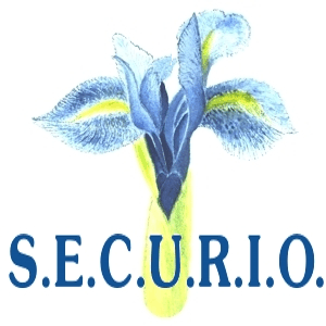
The
original watercolour
painting of the iris in
the SECURIO logo dates
back to the early
eighties of the last
century and, being
exposed behind framed
glass ever since its
creation, it nowadays
bears unfortunately the
yellowish signs of many
lost stories in a
personal history and of
course just for mere
antiquity which always
comes along with the dissipated
energy of all the light
that has been absorbed
by the paper over so
many years. Nevertheless
the painting still shows
its striking watercolour
freshness in all its
manifold subtleties of
the well thought strokes
to reflect the multitude
of aspects of this
beautiful natural
phenomenon that catches
so many varieties of
light in this promising
outburst of life in a
vegetable form that
every hope for love and
prosperous well-being
seems to be fulfilled in
the near future with
certainty.
So, we seem to have had
but little choice in
choosing this picture to
express equally our wish
that our multitude of
communication services
will be acknowledged for
their respective
quality, their well and
thoroughly thought
solutions and
outstanding products and
their contribution to
bringing people together
in a fruitful way.

|